Welcome to my Blog

I'm a professional award winning Portrait artist from NSW Australia.

Not just a likeness- portraits with Life!
I bring your photos to life in paintings that will touch your heart!

A photo freezes a moment while a painting melts hearts.

Capture a moment in their life and
keep it alive in an Heirloom Portrait !

"Your portraits capture more life than a photo ever could!"
Vanessa.


Satisfaction Guarantee .

Have me create a special portrait just for you!.
Supply the photos and then plan the great unveiling!


I have original animal and landscape artworks available for sale on my website.

Learn more at my website-


https://www.suelinton.com.au/wordpress/


Monday, August 12, 2013

Day 8 painting the mural


 Actually this is another session on Day 7.


I had fun last night roughly painting the horses in the mural.I also lightened the ground under the verandah which made a big difference! I like things that make a big difference..lol's


These give you an idea of the size of the figures.. The hard bit is to get them to look good closeup but still have enough zap to look ok at a distance. 
If they don't have enough contrast they may look good closeup but they are just a blob from a distance . But if you have them bold enough to look good at a distance they may look over the top closeup.So it's a constant paint , go back and see how they look , adjust , have another look etc.
Another thing to keep in mind is they have to read correctly in the context of the whole mural. If they are too obvious it will look weird. If you are that far away looking at someone in the real world you can't see their features much.
Lucky most of the blokes have moustaches as that makes it easier as they stand out!I'm still fine tuning the faces. I'll do that at the very end.


 The first version of the horses. I like them as individuals but when I come back in the morning they are positioned wrong. One is further to the front than the other. Grr.
 They are like that in the small version but you don't notice.. Any slight discrepancies are magnified in the larger version once it's projected.. This is why the colour rough is so important.It usually prevents problems like this.

 Day 8
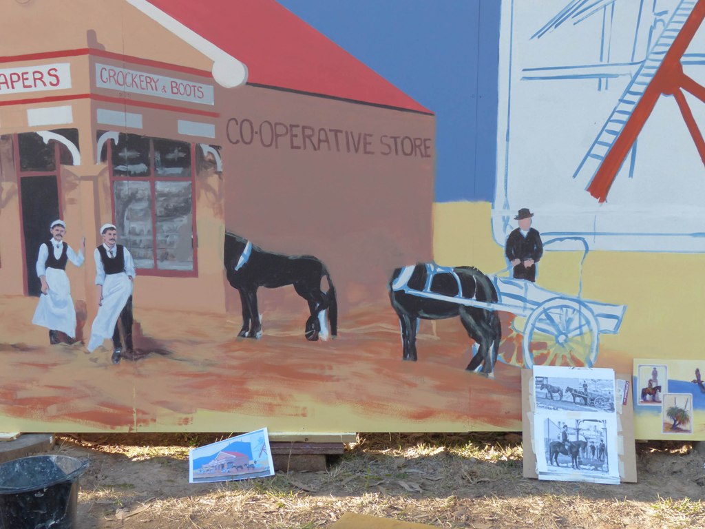

 A bit scary but it has to be done.. Painting over much of the horses to restart.


Notice the lines to help me position them . I measured everything carefully this time. I decided to enlarged the reference photos for each horse scene. Wow what a difference ! I could now see the building has brickwork at the side that shows the groundline better.That will make the building sit more convincingly into the scene .
 While enlarging part of the 1890 photo I noticed that in the background are 2 kids. One teenager lounging on the fence with his cap pulled down and hands in his pockets (he looks a bit of a lout) and the young 10 year old boy who is picking his nose..lol's.. Things haven't changed much in 120 years!

Oh well I spent 1.30hr getting them in a better position .
Ah much better.They are ready for me to come back and detail and add the harness etc.Now to start the man and horse to the left of the building.


 You can see the lout lounging on the fence in the background. I haven't included the nose picker who was near him..
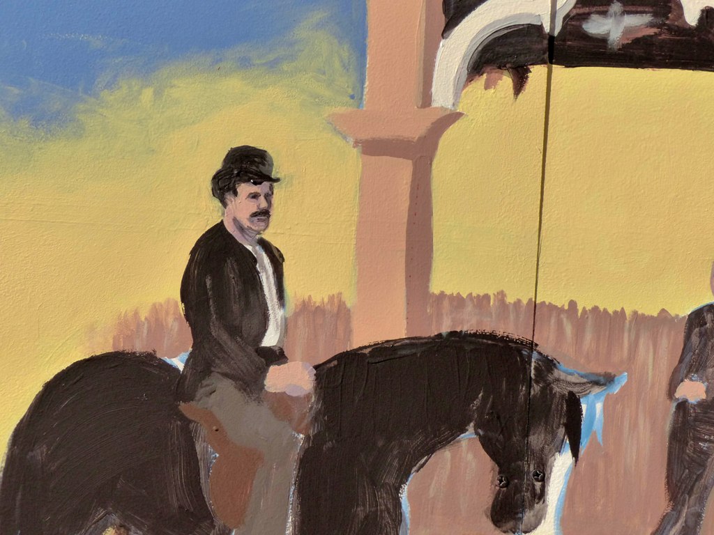


 A pretty rough face . I'll fix him later.


 That's it for this session.

 It's progressing more slowly than I like but it is a big detailed mural! I'll be glad when I have the Co op to the stage where I can start work on the rest of the mural.. It should be a lot faster when I do as each image is only small.
 I did some more later in the afternoon.Here are some photos..I did a bit more of the LHS horse- I'm not happy with it so I'll come back later. I've also done the harness and wagon on the RHS. They looked good until they dried darker so they will need another lot of ligher colours to give them a lift.


Friday, August 9, 2013

Day 7 painting the mural


Another 5 hrs painting..I've started on the figures.I have the two main blokes roughly done. I'm happy enough with their faces but although I have 3 colours in their face you can only see 2 and there faces are a boring pink so I will fix that later. Funny in the shade they looked ok but in full sun boring....
I'll complete the other figures next session + lighten the under the verandah and start on the horses.
I also darkened the side of the Co op .I had it light so the dark horses would show out but it looked weird because as it is in shade it was too light.

I redid the type on that wall ..still a little fine tuning to do.It looked ok in the flesh but in a smaller version I can see some tweaking.It's very hard to get the overall idea of a mural as your painting it because it's so big. The best way to see errors is to take a photo and once it is smaller any problems are very obvious.


I'm not sure if I'll stick with the dark brown horses or change the colour to make them more obvious.It's safer not to go making changes from the colour rough as I know it works. It's hard to tell how the mural is going when only a few sections are complete so if I start changing things I could be chasing my tail.
 A more general view of the mural below.


Thursday, August 8, 2013

Day 6 on the mural


I'm still painting the main building.Here I've started on the glass in the windows.


Now I've suggested produce inside the building.I'm not sure whether to leave this or simplify things back to just a reflection. I'll see how it looks at the end and decide.I've also done the red signwriting on the building and redone the red trim and tidied it up.


I've done the towers on Sugarloaf .I may knock them back a little later so they don't stand out quite as much.I'll see how it looks.The rain was starting to threaten and I was getting really tired but I wanted to put the ground in front of the building in + the fence on the LHS and see if the figures were going to stand out when I do them. Yep I think it is all going according to plan. A lot of correcting and fine tuning to do but it's getting there.
 I was going to do the poppethead and come back to the figures at the end but I think I need them done so I have something to compare the rest of the mural to. I want the Coop to be the focal point so I will adjust everything else so it doesn't compete.
 It doesn't really show up much  as a whole but here is one of the whole mural so you can see how it is going.
Tomorrow I hope to lighten and vary the ground in the front  open the fence up a bit fix the general verticals etc on the Co Op and then do the figures.


I decided to leave everything out ready and just cover it with plastic to protect against the rain (LHS) .That way I won't waste energy getting everything in and out each day and can get going sooner.

Wednesday, August 7, 2013

Day 5 on the mural

Here's the latest on the mural - it's starting to come together but something that size takes a long time! I've been refining the building.
I still need to fix the verandah posts as they are a bit wonky + place the type on the white panels and do a bit on the windows.Then I can move onto the ground below it and the poppethead. I'll come back and fine tune everything at the end when it's all been painted.


Tuesday, August 6, 2013

Getting the mural onto the wall.The projection and early days painting.


Rather than use an A4 size image to project from I decided to use a larger one which would allow me to capture more detail. Here I've printed out the colour rough on 3 A4 sheets to make the  images bigger and easier to see . I've traced around all the figures and then placed a grid over it. The vertical lines correspond to the joins in the panels and the horizontals are just at a 3rd distance. 
Now we will paint the horizontal lines on the mural and just use the joins for the verticals.
 Here is the wall gridded up ready to project. The first attempt was a non event as the projector bulb blew just after this! I sourced another bulb ( + some spares!) and we rescheduled for the next night.

Day 1

Lucky its not summer or I get eaten alive by the ants in the ant nest in the foreground..

Day 2 - 


Above - Doing the first section. I'm correcting the distortion at the out edges. The borders weren't accurate. If you look at the LHS top box border you can see 2 lines - ones the one the projector gave us the other the correct line I measured
 to make it vertical.


 Outlining the grasstree


 The most complicated section - the Co op. I hadn't realised before but as the panels are set onto the ground it means the figures in front of the Coop are going to be very close to the ground and I'll have to kneel to paint them..We'll find out how my old knees like that.. Still it does mean the rest is lower than previous murals I've painted so there is only a small step ladder needed to reach the top. That will really speed things up!


 Pretty rough but they are only for placement.I'll fine tune them and get the proportions more accurate etc as I paint each figure.


 Final section! Note the 2 marks above the  Mine Poppethead. I had decided I wanted the Poppethead a bit higher so we used the general overlay for the box and then moved it up so the Poppethead sat on those two marks to get it to sit in the box well. The poppethead is where the miners used to get lowered up and down into the mine. I used a logo used in the West Wallsend Primary School centenary celebrations and I've simplified this one a bit for design purposes.

Day 3 -

Phew .. Finally all ready to go and not one projector bulb blew!


 I've started doing the large areas first as they will be quickest and it will also allow me to see how the overall effect will be early on in the process. I mixed the colours in the mural colour rough and everything should have been fine but it wasn't.. I found I had to lighten each colour and the original background colour and mountains had to be redone a few times until I was happy. I've also painted out the horizontal gridlines.

Day 4 -


 Here you can see I've painted the mountains but I fell they are too dark compared to the colour rough. I want to keep to it's colour scheme as I know it works so I am experimenting with lighter colours until I think it will work and still be interesting.


Finally I'm happy and repaint the mountains.I will also repaint the foreground yellow as it needs to be a bit brighter and more yellow ( warmer).


I've started on the main colours for the building to see how it will all look. I've actually done more than this but the mural was in dappled shade so doesn't photograph well. I'll get some photos later when it's in shade.


This is where I got to at the end of the day. I changed the front yellow colour to a darker brighter one .I tested a colour for the poppethead and that worked so it will be ready to go when I am. My next step will be to detail the main building more and do the shadowed area under the verandah.

Monday, August 5, 2013

The creation of the mural colour rough for the Wallsend Heritage Mural


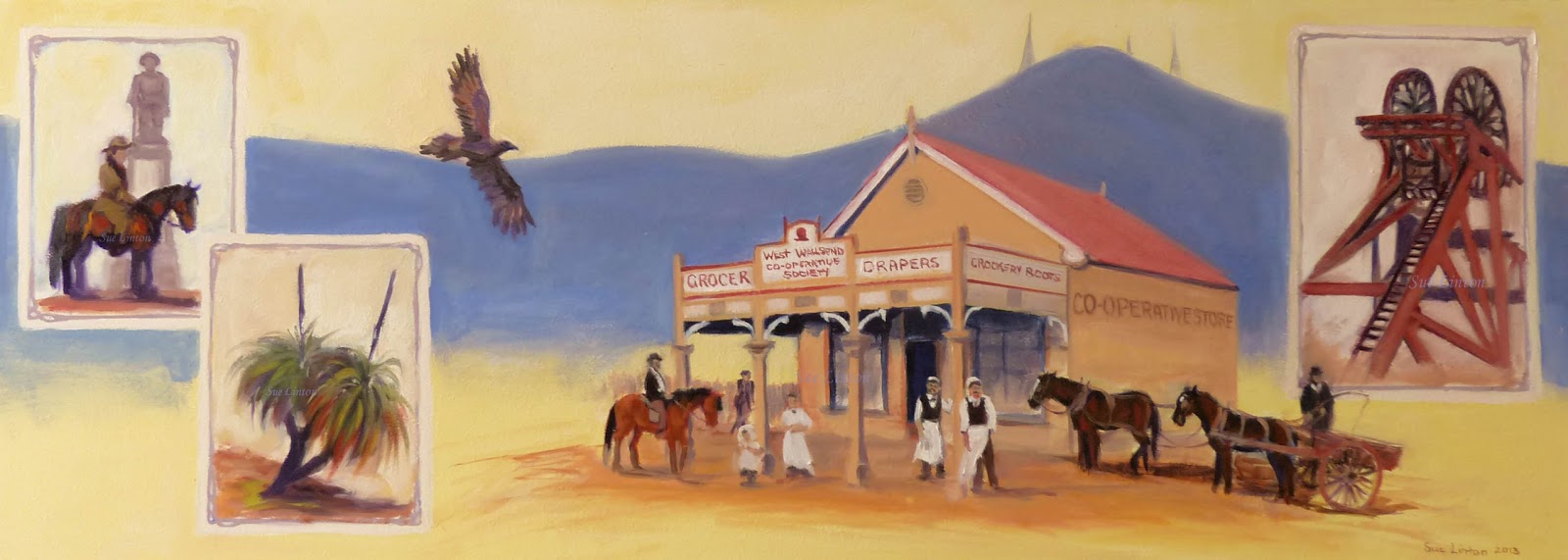
I created a smaller colour version of the mural to nut out all the problems with colour before it went on the wall. Much easier to correct a small version with a flick of the paint brush than spend a few hours changing the same thing on the wall! Here is the finished version.


 The actual figures are very small so I couldn't put much detail into their faces and I couldn't spare a lot of time to finish it to my usual level. I was  keen to start the actual mural as I know it will take a while to paint and it has to be ready in September.


Above -  I'm starting to work out a colour scheme. I won't be able to make the images really colourful as I feel for the historic period I'll have to be a little conservative with the Co op store colours. As I want that to be centre stage all the other images will have to be marginally less colourful. So to get some zap into the mural I decided to have the mountains as a design rather than realistic then I could use some interesting colours and they will still ' read ' as natural.The background can be colourful now.


Here you can see my reference material - the original B & W  version for placement gridded up to make it easier to get everything placed correctly. With such a complicated mural if I got the Co op too far to the left when drawing it up it would make everything out of whack.


Further along.I had to think about background colours for each box - colours that would highlight each subject but not take your eye away from the Co op.Almost done I just have to detail the figures to the front of the centre Bay horse and rider. There's a little story going on there ( I love stories ). The horse is looking at the little child who is absorbed in her own world.

OK I'm happy with that. Now if I follow this on the wall it should be easy ...( shouldn't it..?? lol's)

Tuesday, July 30, 2013

The creation of Muffy , Tuffy & Scruffy


Chris contacted me wanting a portrait of her 3 terriers Muffy , Scruffy and Tuffy. She had been thinking about it for a while but the catalyst was when her favourite Muffy died. Chris missed her terribly and hoped the portrait would help her feel Muffy was still with her.


Muffy was 14 years of age when she passed away, Scruffy is 9 years old and Tuffy is 4 and half. They got on so well together Muffy & Scruffy really loved each other.  


 We had to make do with the photos we had of Muffy. We had a favourite one for the pose and others to help with details and colour, The favourite photo was lovely but had been taken outside and wasn't really sharp - I couldn't see the details in her eyes or nose.I ended up working form about 4 different photos. This is difficult as you can't compare the portrait to any one photo to check if things are correct- it does give the best result though!
 I went and took photos of Scruffy and Tuffy. We chose a typical pose of Scruffy who always looks sad and ............Scruffy ( lol's) and one of Tuffy looking cute.."I'm so cute..."

From top RHS clockwise- Muffy , Tuffy & Scruffy
Here I've done a rough tonal underpainting in acrylic to get position and shapes.


 Below- I've started on Muffy in Oil paint over the acrylic. I wanted to paint her first as I knew she would be the hardest because her photo wasn't clear and I had to use extra photos to get her colour eye details etc.


 Muffy is roughly done. It's a large painting so I decided to get each dog to a similar amount of finish so I could assess the overall impression. Now to move onto the others. I'll come back later and finish off Muffy.


 Below - Scruffy has been painted to a similar level of finish. I know she is too blue but that doesn't worry me as I will wait for her to dry a  bit and come back over her and tone the blue down. I don't want to use blacks and greys as the portrait would be lifeless and boring. I want to use as much colour as I can but still have them look like the dogs.


 Below- Now I've done Tuffy.I'm really enjoying painting them and laying the brushstrokes down. I am really happy with Tuffy as he looks cute and the colours are interesting and believable.I will finish him of more at the end but he'll do for now .I don't want to lose the freshness and life the portrait has by killing it with detail!
I still feel Scruffy is too blue although I have added other colours. She is a dark silvery blue grey and a bit lighter out in the sun. I will subdue the blue  a bit more. I'm happy with their expressions. The background colour looks great with the frame I have chosen but I feel I need to change it to make the portrait more cohesive.


 Below- I still haven't changed the background colour but each dog is pretty finished.


Below - The finished portrait
I changed the background colour and Chris had me make a few adjustments to Muffy's colour. The photo for the pose was taken out in the sun but I used another photo taken inside with a flash for the colour and it had her nose a lighter inaccurate colour- flash photos can do that! A few more little adjustments and Chris decided it would be better to come and see the portrait in the flesh for the final approval.


Muffy , Scruffy and Tuffy
71 x 76cm framed size
Oil
'I just love it! It's SO them. It's like she's here..'
Chris
  Muffy passed away recently and Chris really misses her.
She really wanted the portrait to help her feel that Muffy is still with her . She wasn't sure if I'd captured her when she viewed the photo I emailed through so decided  it would be better to see the actual portrait to make a decision.
She loved the portrait!
Portraits certainly look better in the flesh. I can fiddle around for a couple of hours changing things and I can see the difference in the original painting but you can hardly tell looking at a photo of it on the internet- especially if the portrait is a larger one like this one of Muffy , Scruffy and Tuffy.

The portrait will have a lovely white distressed wood frame and should make a great impression in the hall where Chris has a skylight and special light especially for Oil painting viewing.
The more light you have on my portraits the more subtle colours you will see so good lighting is very important to show your portrait to best advantage.

Thursday, July 18, 2013

2013 fully booked I'm taking portrait bookings for 2014 now.

If you have been thinking of having a portrait created you can book for a late Jan 2014 start now. Later bookings will be scheduled in as they are received. To book in means you grab a spot in my queue.
 If you book now you'll know your portrait will be created early next year and you will have plenty of time to organise photos and budget for the special event!
So plan  ahead - talk to me about your ideas. A 30% deposit grabs you a spot and then you have the option of my interest free payment plan in the months ahead so you will be ready when your portrait is finished.

Wednesday, July 10, 2013

The memorial portrait of Bonnie


 Bonnie passed away a while ago and Greg asked me to create her memorial portrait as a secret gift for Kate.
We didn't have many sharp flattering photos of her but it was decided we'd use the favourite face photo of her taken outside and place it on a suitable body taken inside.
We chose a body with a typical pose. Another decision was whether to paint her with both ears natural or as she was in later life with one ear up and one down.
The framed portrait is approx 51 x 51cms.
 In memory of Bonnie
 Framed Oil

Here is what Greg said when I asked how the portrait unveiling went -
'It went wonderfully, Kate is delighted with her and is amazed (as is everyone else who has been around to see her) at your talent and loves that you've really captured Bonnie's expression beautifully!!! And I agree. I was explaining to Kate how I'd been worried about whether I'd chosen the right pose and expression, whether to go with pre or post floppy ear and so on but she couldn't be happier with what we went with, so thank you for your patience and guidance.

And thank you again for a wonderful and enduring portrait. We both love it and she sits in pride of place beside the door so that Kate can see her as she comes and goes each day.!!!


Monday, July 8, 2013

West Wallsend Heritage Mural continued..


 Primed and ready to go! 
Most artist get nervous  when they are going to start a painting and are  looking at a blank canvas- it's quite intimidating.. Imagine how I feel looking a a 2.4 x 6.7m blank canvas! lol's
Notice the large anthill in the foreground. Lucky it's winter and they are hibernating or doing whatever ants do in winter or I'd be eaten alive everytime I walked back to check how the mural was looking..
 I notice the mural gets the sun from quite early in the day. That will make it a bit more challenging as the paint dries almost as soon as it hits the panel which makes it hard to blend and soften effects. 
 Another thing to keep in mind is that at home the panels face NW and will be very glary to paint until I get rid of the white. They will also be in sunlight. When it is installed it will be facing East and not get much or any direct sun. I will need to take regular photos of the mural in the shade as I paint to check it looks bright enough. If you are painting a surface in bright light its easy to paint it too dull. It will have to look a bit over the top in sunlight so it is colourful in the shade once installed.

Tuesday, July 2, 2013

The creation of the West Wallsend Heritage mural

 The mural is going to go on the front of the Workers Club building under the West Wallsend sign. I am painting it at home on panels. It will then be carried down in pieces , reassembled on site and attached to the frame that will be screwed into the buildings facade.


Murals are slow work! So far all we have done is make the frame to hold the panels and put half of it up.
I'm  coming up with a concept and I've sent one through and made a change and sent another idea back. Once the concept is approved I can then get permission to use some photos reference from a book and go take any extra photos I need . Once I have all the photos I will do a small colour version to nut out all the design and colour problems and have that approved.
Although it takes a lot of time to do a smaller version it's much easier to change something on a small scale than on the wall! Once I start painting the mural I'll know exactly where I'm going.

 My partner made the frame one weekend inside the garage. Lucky he is helping as no way could I have done that ! Now we have bought it outside and placed it in position against the back of the studio.


Above -  This gives a better idea of the size of the mural.

Last weekend in June -
Below- The frame is attached to the wall. He  made brackets to hold it in position on the wall so I can paint. Everything has to be square or when the panels are attached they will be uneven and warped.


Hopefully this weekend we can attach the lot and put the panels on. I then need to prime the exposed frame and panels. Once that is done I do all the indoor planning with the small version and then trace the small version and project it onto the panels. I can then start to paint! That will probably be a month away.

The local school children are to help with some of the mural so I will have to unscrew a panel or two and take it down to West Wallsend for them to paint and then bring it back rescrew it and continue.


 This  is the concept for the mural.
West Wallsend was built on mining so the poppethead in the RHS symbolises that.
 The LHS top image will be the war memorial with a lighthorse rider in front.
 Below that are grasstrees. They grow only a few inches a year and the large ones are 100's of years old. There are many on the top of Mt Sugarloaf and the grasstrees were used and had special significance for the aboriginal people of the area.
The main image is the Coop store of the area. The bird in the sky will be an Eagle which is the totem for the Awabakal people of the area.
 The town sits below the Sugarloaf range and Mt Sugarloaf so that links the whole mural.I'm still getting permission to use some of the images but hopefully that will go ahead and I can start planning the small colour version. 

 Assuming everything is opk using the Co op image I have to organise a photo shoot for the Lighthorse and take some photos of the monument. The horse doesn't have to be near the monument. It can't stand in front of it anyway as there are steps. I am going to use artistic liscense there.
 I also need to go and take photos of the Suagarloaf range from the town so it is a bit more accurate.It will be more of a design feature than realistic but I do want the shapes to be recognisable. I also want to go to the top of Mt Sugarloaf and take Grasstree photos and go to Kitchener and take photos of the Mine Poppethead there. 

Sat 6th July - A good days work today. The frame is finished and primed and the panels on! Now I just have to prime the panels and get the smaller colour version sorted out.


Priming the frame in my sacrificial clothes..


  All up and ready to prime. The panels are quite heavy so I will need to help to move and take them down for the schoolchildren. I might start another thread from now on as this one is getting a bit long.